

The Pennsylvania Turnpike gets more and more utilitarian and less and less beautiful each day.
First, there are those new 52-inch-high concrete median barriers. They're there for safety, but unless you're high up in a truck or SUV, the main view to your left is now concrete.
There are all those billboards, where none were ever meant to be.
Some of the old Colonial-style stone rest stops have been sold and now house businesses right beside the pike — one is an auto auction, another sells mining machinery.
Even rebuilt parts of the pike are wanting. Newly opened, six-lane sections between Pittsburgh and Somerset are safer and easier to drive. But the original pike was landscaped with trees. Today, they're leaving huge hillsides in nothing but grass.
And, worst of all, are the new rest stops. The contrast between badly planned rest stops being built today on the Pennsylvania Turnpike and comfortable new rest stops on the Ohio Turnpike is so extreme that it is dispiriting.
All of this is unfortunate, because the Pennsylvania Turnpike — our nation's first superhighway — has always been one of the most beautiful. It was designed that way, and there's still a lot to be said for it. Pennsylvania's gorgeous mountains and valleys still delight travelers.
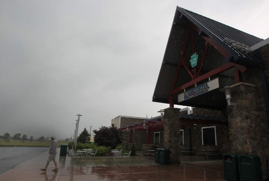
Yet, good design now appears to be in the back seat where new projects are concerned, and that's no more readily apparent than in the new rest stops. Let's compare the Portage plaza that you encounter going west at mile 97 on the Ohio Turnpike and the Sideling Hill plaza at mile 172 in Pennsylvania.
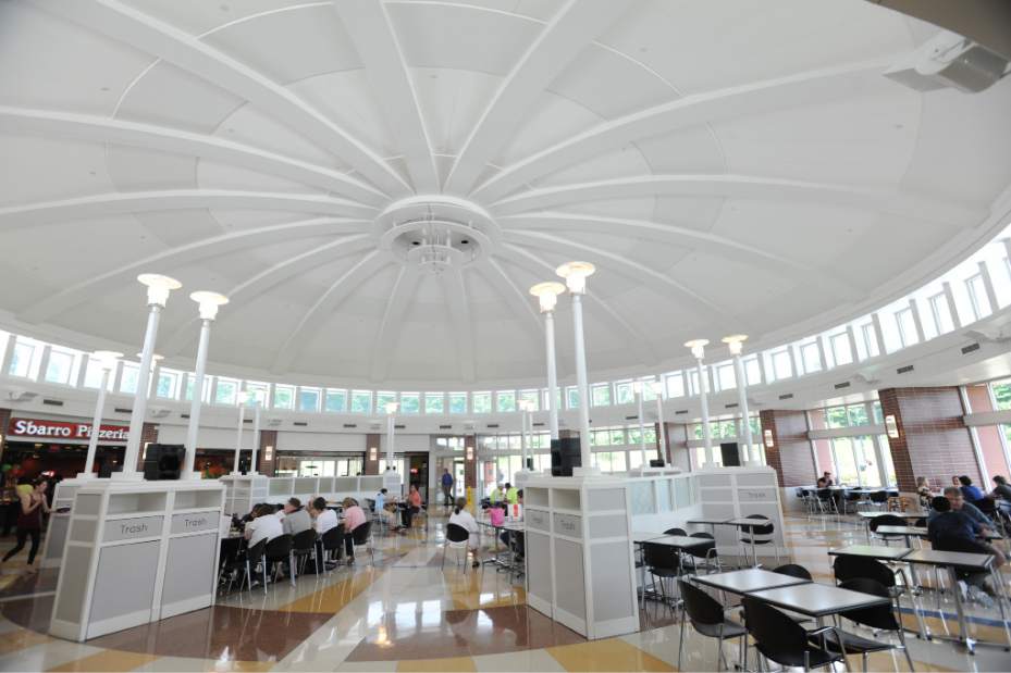
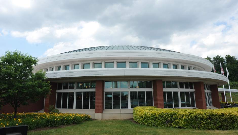
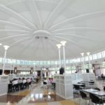
The first thing you notice about the Ohio building is the style. Copied from the later work of Frank Lloyd Wright, it is a low, red-brick structure with a long, white entrance canopy, a white pylon marking the main entrance, and a prominent, circular, domed food court.
But style and Wright-imitation are not the key. It's what's inside that makes it so good. Good architecture only starts with what you see from the outside. It's the way spaces are shaped and organized inside and how those spaces make you feel that determine whether the architecture is good or bad.
Here, you experience good from the start. The canopy at the main entrance is low. It's a compressed space (but only from above — there's still lots of side-to-side room for crowds), and it sets you up to be surprised when you enter into a high-ceilinged and spacious entrance hall.
All parts of the building can be accessed from this huge curving hall — rest rooms, gift shops, facilities for truckers and the food court. And virtually all of the cross-traffic occurs only here.
When you enter the food court — through another low-ceilinged transitional space — you still find the routine McDonald's or Starbucks, but in an comparatively relaxed setting.
The high, circular food court is domed and brightly lit by clerestory windows above. The fast food places are set along the back. And, though all parts of this
circular space are easily accessible through wide aisles, the eating tables are separated into sections by low partitions. About half the tables are in wide-windowed bays at the curving front wall.
And at Pennsylvania's Sideling Hill?
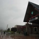
No such delight. This is one of the largest plazas on the turnpike, serving both eastbound and westbound travelers. It sits high up in a beautiful valley where the pike going west disappears dramatically as it climbs into the mountains in a picturesque curve.
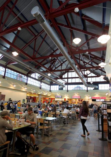
Yet, there is no way to experience this view from inside. The plaza building does not have a single window at seating level. You are walled off on four si
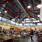
des by fast food shops, restrooms and the convenience store. Worse, all the tables — far from being in small sections as in Ohio — are lined up in rows, mess-hall style, in one wide-open barn-like room. Even worse, travelers enter the eating area directly from outside and walk among those already eating to get to the restrooms or the fast-food stalls.
The entire aspect of this space is anything but restful. It's hurried, noisy, crowded and unpleasant.
Outside, you can see about a dozen of what appear to be windows — most of them with awnings. But almost all these “windows” are fakes. They are in the opaque back walls of the rest rooms and fast food outlets.
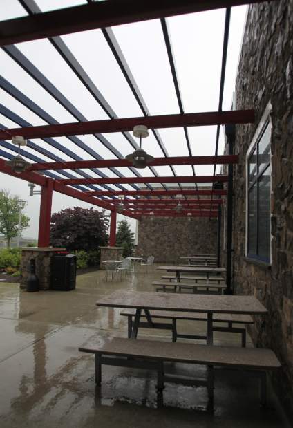
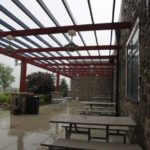
The travesty does not stop there. A beautiful broad lawn slopes from the building down toward the 'pike with a natural spot right at the front of the building for what could be a patio, good for sitting in the summer months facing the mountain and valley view. So, what's here?
You won't believe it until you see it. It's the garbage loading dock and the air conditioning equipment — right where the people ought to be!
The style of the new Pennsylvania rest stops is a modern glass, steel and stone interpretation of Arts & Crafts-era Adirondack architecture. It's attractive, in and of itself. And many of them — the Oak
mont-Plum plaza is one — have tables by front windows and pleasant enough patios for the summer months. But they all still have this same mess-hall-style eating, with the same minimal design that brings travelers directly into the table areas with all the cross-traffic that entails.
A restful rest stop? Not in Pennsylvania, unfortunately.
John Conti is a former news reporter who has written extensively over the years about architecture, planning and historic-preservation issues.